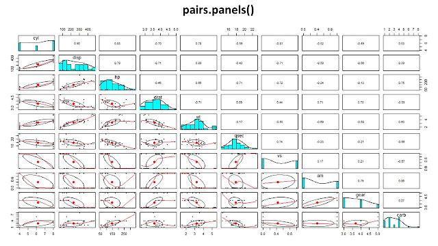
The correlation between the variables in a data frame measures the strength and direction of the linear relationship between them. The correlation coefficient can range from -1 to 1, where -1 represents a perfect negative linear relationship, 0 represents no linear relationship, and 1 represents a perfect positive linear relationship.
There are several ways to
calculate the correlation between the variables in a data frame in R, the most
common methods are:
- Pearson correlation coefficient: This is the most widely
used method for calculating correlation. It measures the linear
association between two continuous variables and is calculated using the cor()
function in R.
- Spearman rank correlation coefficient: This method is
used when the data is ordinal or when there is a non-linear relationship
between the variables. It is calculated using the cor() function in
R with the method = "spearman" argument.
- Kendall rank correlation coefficient: This method is
similar to the Spearman rank correlation coefficient but it is more robust
to outliers. It is calculated using the cor() function in R with
the method = "kendall" argument.
Once you have calculated the
correlation coefficients, you can visualize them using functions like pairs(),
corrplot(), ggcorrplot() and more.
It's important to note that
correlation does not imply causality, it only shows the strength and direction
of the linear relationship between two variables.
Here are some examples:
First lets Load the packages that
we are going to need.
cor(df): This function calculates the Pearson correlation coefficient between all pairs of variables in the data frame.cor(df, method = "spearman"): This function calculates the Spearman rank correlation coefficient between all pairs of variables in the data frame.PlotCorr(r_pearson): This function plots the correlation matrix using the Pearson correlation coefficients.PlotCorr(r_spearman): This function plots the correlation matrix using the Spearman rank correlation coefficients.
corr.test(data, method =
"spearman", adjust = "none")$p performs a significance test
of the correlation coefficients using the Spearman rank correlation method. It
returns the p-values of the test and assigns it to the variable “seg_mat”.
ggcorrplot(corr = r_spearman,
hc.order = TRUE, type = "lower", p.mat = anlam_mat) creates a visual
representation of the correlation matrix using the Spearman rank correlation
coefficients and the p-values of the significance test. It uses hierarchical
clustering to order the variables and it shows only the lower triangle of the
correlation matrix. The function is from the ggcorrplot package.
corrplot(r_spearman, method =
"pie", type = "upper") creates a correlation plot with pie
charts to represent the correlation coefficient values. It uses the Spearman
rank correlation coefficients and it shows only the upper triangle of the
correlation matrix. The function is from the corrplot package.
This code is using the Spearman
rank correlation coefficient to evaluate the correlation between variables in
the data frame "df" and it is showing the results in two different
ways: one using ggcorrplot package and the other using corrplot package. Both
functions are showing the p-values of the significance test as well.


0 Comments:
Post a Comment