Search This Blog

Showing posts with label R. Show all posts

Multiple Linear Regression Analysis And Visualization


Dataset

The mtcars data set is a built-in data set in R that contains information on various car models. It was collected by Motor Trend magazine in 1974 and includes the following variables:

mpg: Miles per gallon (response variable)

cyl: Number of cylinders in the engine

disp: Engine displacement (in cubic inches)

hp: Engine horsepower

drat: Rear axle ratio

wt: Weight (in 1000 lbs)

qsec: 1/4 mile time

vs: V/S variable (0 = V-engine, 1 = straight engine)

am: Transmission (0 = automatic, 1 = manual)

gear: Number of forward gears

carb: Number of carburetors

This data set is commonly used as an example in statistics and data analysis tutorials and courses, as it is small and easy to work with, yet still contains a variety of variables that can be used to demonstrate different techniques and analyses.

The first line of code fits a multiple linear regression model using the mtcars data set, with the response variable (mpg) and the predictor variables (disp, hp, and drat).

The second line of code displays a summary of the model, including the coefficients, p-values, and other statistics.

Call:

lm(formula = mpg ~ disp + hp + drat, data = mtcars)


Residuals:

    Min      1Q  Median      3Q     Max 

-5.1225 -1.8454 -0.4456  1.1342  6.4958 


Coefficients:

             Estimate Std. Error t value Pr(>|t|)   

(Intercept) 19.344293   6.370882   3.036  0.00513 **

disp        -0.019232   0.009371  -2.052  0.04960 * 

hp          -0.031229   0.013345  -2.340  0.02663 * 

drat         2.714975   1.487366   1.825  0.07863 . 

---

Signif. codes:  0 ‘***’ 0.001 ‘**’ 0.01 ‘*’ 0.05 ‘.’ 0.1 ‘ ’ 1


Residual standard error: 3.008 on 28 degrees of freedom

Multiple R-squared:  0.775,     Adjusted R-squared:  0.7509 

F-statistic: 32.15 on 3 and 28 DF,  p-value: 3.28e-09


The third line of code loads the car package, which is a package for data analysis.

The fourth line of code produces added variable plots (also known as partial regression plots or component-plus-residual plots), which are used to visualize the relationship between the response variable and each predictor variable, while holding the other predictor variables constant.


Visualizing correlation between variables


The
correlation between the variables in a data frame measures the strength and direction of the linear relationship between them. The correlation coefficient can range from -1 to 1, where -1 represents a perfect negative linear relationship, 0 represents no linear relationship, and 1 represents a perfect positive linear relationship.

There are several ways to calculate the correlation between the variables in a data frame in R, the most common methods are:

  1. Pearson correlation coefficient: This is the most widely used method for calculating correlation. It measures the linear association between two continuous variables and is calculated using the cor() function in R.
  2. Spearman rank correlation coefficient: This method is used when the data is ordinal or when there is a non-linear relationship between the variables. It is calculated using the cor() function in R with the method = "spearman" argument.
  3. Kendall rank correlation coefficient: This method is similar to the Spearman rank correlation coefficient but it is more robust to outliers. It is calculated using the cor() function in R with the method = "kendall" argument.

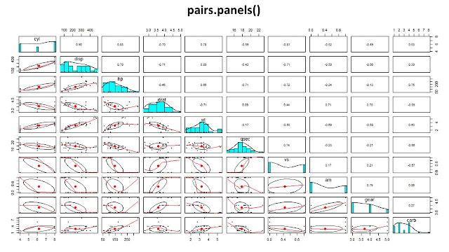
Once you have calculated the correlation coefficients, you can visualize them using functions like pairs(), corrplot(), ggcorrplot() and more.

It's important to note that correlation does not imply causality, it only shows the strength and direction of the linear relationship between two variables.

Here are some examples:

First lets Load the packages that we are going to need.


  1. cor(df): This function calculates the Pearson correlation coefficient between all pairs of variables in the data frame.
  2. cor(df, method = "spearman"): This function calculates the Spearman rank correlation coefficient between all pairs of variables in the data frame.
  3. PlotCorr(r_pearson): This function plots the correlation matrix using the Pearson correlation coefficients.
  4. PlotCorr(r_spearman): This function plots the correlation matrix using the Spearman rank correlation coefficients.


corr.test(data, method = "spearman", adjust = "none")$p performs a significance test of the correlation coefficients using the Spearman rank correlation method. It returns the p-values of the test and assigns it to the variable “seg_mat”.


ggcorrplot(corr = r_spearman, hc.order = TRUE, type = "lower", p.mat = anlam_mat) creates a visual representation of the correlation matrix using the Spearman rank correlation coefficients and the p-values of the significance test. It uses hierarchical clustering to order the variables and it shows only the lower triangle of the correlation matrix. The function is from the ggcorrplot package.


corrplot(r_spearman, method = "pie", type = "upper") creates a correlation plot with pie charts to represent the correlation coefficient values. It uses the Spearman rank correlation coefficients and it shows only the upper triangle of the correlation matrix. The function is from the corrplot package.


This code is using the Spearman rank correlation coefficient to evaluate the correlation between variables in the data frame "df" and it is showing the results in two different ways: one using ggcorrplot package and the other using corrplot package. Both functions are showing the p-values of the significance test as well.

Pie Charts to visualize goal contribution of Samsunspor strikers

A pie chart is a circular statistical graphic, which is divided into slices to illustrate numerical proportion. In a pie chart, the arc length of each slice is proportional to the quantity it represents. Pie charts are widely used to show percentage or proportional data and usually the total sum of all segments needs to equal 100%.

There are several R functions that can be used to create a pie chart, some of the most popular ones are:

  1. pie() : This is a basic function in R to create a pie chart. It takes in a numeric vector of values as input and creates a pie chart with each element of the vector representing the proportion of the corresponding slice.

pie(x, labels, radius, main, col, clockwise)

Following is the description of the parameters used −

  • x is a vector containing the numeric values used in the pie chart.
  • labels is used to give description to the slices.
  • radius indicates the radius of the circle of the pie chart.(value between −1 and +1).
  • main indicates the title of the chart.
  • col indicates the color palette.
  • clockwise is a logical value indicating if the slices are drawn clockwise or anti clockwise.

  1. pie3D() : This function creates a 3D pie chart. It takes in the same input as the pie() function, but also allows for additional customization options such as colors, labels, and explode value. 
   3. ggplot2::ggpie() : This function is part of the ggplot2 library, and allows for more advanced customization options for creating a pie chart. It also allows for the creation of a pie chart with multiple layers and the use of different scales.

You can use any of the above functions to create a pie chart in R, depending on your specific needs and the level of customization you require.

Radar Plot in ggplot2 Comparing Alim Öztürk and Uğur Demirok


This article runs through the creation of basic radar charts in R, plotting the data of two players, before creating a function to streamline the process.

This code defines two players' attributes by creating AlimOzturk and UgurDemirok vectors and then combines them into a data frame. It assigns the column names of the data frame to the variable Attributes and the number of attributes to the variable AttNo. Then it creates a new data frame by adding the first column of the data frame again at the end of the dataframe.

This code creates a function called circleFun which takes in three parameters: center, diameter and npoints. The function calculates the radius and creates a sequence of points on the circle using trigonometry. The function then returns a data frame with x and y coordinates of the points on the circle. Then it creates four circles with different diameters by calling the circleFun function four times and passing in different diameter values. Next, it splits the angles into segments by dividing 2pi by the number of attributes in the data frame and creating a sequence from 0 to 2pi with a length of angle_spilt.

This code creates two empty data frames LineData and TitlePositioning. The LineData data frame has two numeric columns x and y and stringsAsFactors is set to F. The TitlePositioning data frame has three columns: title, x and y with the title column being of character type and x and y being of numeric type. Also stringsAsFactors is set to F. These data frames are used to store the data needed to create the lines and labels in the radar chart.

This code creates the data needed for the background construction of the radar chart. It loops through the columns of the data frame and calculates the x and y coordinates for each segment of the chart by using trigonometry. It stores the x and y coordinates in the LineData data frame. It also creates the title data by looping through the columns of the data frame, calculates the x and y coordinates for the title position using trigonometry and stores the title, x and y coordinates in the TitlePositioning data frame.

Then it creates the value labeling data. It creates a values vector containing the values 25, 50, and 75. It calculates the radian for the values by dividing the angle_spilt by 2. Then it calculates the x and y coordinates for the values using trigonometry and stores the values, x and y coordinates in the ValuePositioning data frame.

It adds the origin values (0,0) for the lines by adding two columns x2 and y2 to the LineData data frame and assigns the values 0 to these columns.

It creates an empty data frame called polydata and creates the polygon data for the players by looping through the columns and rows of the data frame, calculates the x and y coordinates for each attribute of each player using trigonometry and stores the player name, value, radians, x and y coordinates in the polydata data frame. This data will be used to plot the polygons representing each player's attributes on the radar chart.

This code splits the data into two separate data frames for player 1 and player 2 by using the unique function to find the unique player names in the polydata data frame and then using the which function to filter the rows that correspond to each player.

It then creates the title strings for each player by using the gsub function to insert a space before any uppercase letters in the player names and then using the trimws function to remove any white spaces from the beginning and end of the player names. The Player1_title and Player2_title variables will be used to add titles to the radar chart.

This code generates a radar chart using the ggplot2 library in R. It creates several dataframes to hold the data for the chart, including:

LineData: the data for the lines that will form the segments of the radar chart

TitlePositioning: the data for the titles of the attributes/values that will be displayed on the chart

ValuePositioning: the data for the values that will be displayed on the chart

polydata: the data for the polygons that will be used to display the data for each player

It also creates four circles using the circleFun() function, which is defined at the beginning of the code. These circles will be used as the background of the chart.

The code then uses the ggplot() function to create the chart, adding the circles, segment lines, attribute/value titles, and polygons for each player. It also adds the title for each player and some additional formatting.

This code generates a radar chart using the ggplot2 library in R. It creates several dataframes to hold the data for the chart, including:

  • LineData: the data for the lines that will form the segments of the radar chart
  • TitlePositioning: the data for the titles of the attributes/values that will be displayed on the chart
  • ValuePositioning: the data for the values that will be displayed on the chart
  • polydata: the data for the polygons that will be used to display the data for each player


Detecting outliers in R

Outliers are data points that are significantly different from other observations in a dataset. They can occur for a variety of reasons, such as measurement error, data entry errors, or other factors. For example, in a dataset of housing prices, an outlier might be a property that is priced significantly higher or lower than the other properties in the dataset. Outliers can have a significant impact on the overall analysis of a dataset, and so it is important to identify and handle them appropriately.


There are several methods for identifying outliers in a dataset, such as using statistical measures like the mean and standard deviation, or using visualization techniques like box plots or scatter plots. Once outliers have been identified, they can be handled in several ways. One common approach is to simply remove them from the dataset, although this can be problematic if the outliers are legitimate observations that should be included in the analysis. Another approach is to treat them differently in statistical analysis, such as by applying robust statistical methods that are less sensitive to outliers.

It is important to note that outliers can indicate a mistake or error in the data, but sometimes it could represent a real phenomena that is interesting to investigate. Thus, it's always important to investigate the cause of outliers before making a decision on how to handle them.

Data

The mpg (miles per gallon) dataset is a dataset containing information on various car models and their fuel efficiency. It typically includes columns for the car's make and model, number of cylinders, horsepower, weight, and miles per gallon (both city and highway). This dataset is commonly used for teaching data analysis and visualization techniques, as well as for regression analysis and machine learning. It is also available in R, Python and other programming languages. The data includes observations for 234 cars.

The columns in the dataset are:

  • mpg: Miles per gallon, continuous
  • cylinders: Number of cylinders, multi-valued discrete
  • displacement: Engine displacement (cu. inches), continuous
  • horsepower: Engine horsepower, continuous
  • weight: Vehicle weight (lbs.), continuous
  • acceleration: Time to accelerate from 0 to 60 mph (sec.), continuous
  • model year: Model year (modulo 100), multi-valued discrete
  • origin: Origin of car (1. American, 2. European, 3. Japanese), multi-valued discrete
  • car name: Name of car

This dataset is commonly used for teaching data analysis and visualization techniques, as well as for regression analysis and machine learning. It is not just available in R, but in Python and other programming languages.

Method

You can use the "ggplot2" and "dplyr" packages in R to identify outliers in the "mpg" dataset. Here's an example of how you might use these packages to create a box plot of the "hwy" variable and identify outliers:

This code will create a box plot of the "hwy" variable from the "mpg" dataset using the ggplot() function and the geom_boxplot() geometry to create the boxplot, it also adds the title, x and y labels using ggtitle(), xlab(), ylab() functions respectively.


Then, it uses the Tukey method to identify outliers, the Tukey method defines an outlier as any data point that is more than 1.5 times the interquartile range (IQR) away from the upper or lower quartile. It uses the quantile() and IQR() functions to calculate the quantiles and IQR of the "hwy" variable, and the which() function to find the observations that are considered outliers. Finally, it prints the identified outliers.

It's important to note that this method is based on the assumptions of the data, and the Tukey method is just one of the many methods available to identify outliers, other methods include Z-score, Mahalanobis distance, etc. It's always good to check the data and try different methods to confirm the outliers. Additionally, it is important to visually inspect the data using plots such as boxplots, scatter plots, etc. before and after identifying outliers.

Pressure Heat Map In Football Using R

In this blog, the Pressure Heat Map for Tottenham Hotspur  will be created. To do this, two data frames containing Tottenham's shot data will be created. you already remember the dataset from my previous blog Pass Map. The following lines of code(which include the organization of the dataset) will be run:

This last line of code is using the tidyverse library to create a data frame containing the pressure events for Tottenham Hotspur in a soccer match. The clean_df data frame, which was created in the previous code block, is filtered to only include rows with a team.name of "Tottenham Hotspur" and a type.name of "Pressure". The resulting data is stored in a new data frame called Tot_pressure.

This code is using the ggplot2 package from the tidyverse library to create a visualization of the pressure events for Tottenham Hotspur in a UEFA Champions League Final match that took place in the 2018/2019 season.

The ggplot() function is used to specify the data that will be plotted, which in this case is the Tot_pressure data frame that was created in the previous code block.

The annotate_pitch() function is used to draw the soccer pitch on the plot, using dimensions provided by the pitch_statsbomb object and using the specified fill and color values.

The geom_density2d_filled() function is used to create a heat map of the pressure events, using the location.x and location.y columns for the x and y coordinates, respectively. The fill aesthetic is used to color the heat map based on the level of density, and the alpha parameter is used to set the transparency of the fill color. The contour_var parameter is used to specify the variable that will be used to calculate the density.

The scale_x_continuous() and scale_y_continuous() functions are used to set the limits of the x and y axes, respectively.

The labs() function is used to add titles, subtitles, and a caption to the plot, and the theme_minimal() and theme() functions are used to customize the appearance of the plot, including the background color, font family and color, and the visibility of certain elements such as the grid and axis labels. The legend.position parameter is set to "none" to hide the legend.

Running the codes above will yield the following pass map:


Credit: Irfan Alghani Khalid Published in Towards Data Science


Shots Map in football using R

In this blog, the shot map for Tottenham Hotspur and Liverpool will be created, but with the shots generated by each club plotted on different coordinates. To do this, two data frames containing Liverpool and Tottenham's shot data will be created. you already remember the dataset from my previous blog Pass Map. The following lines of code(which include the organization of the dataset) will be run:

The last two lines of code create two data frames containing shot data for Liverpool and Tottenham Hotspur, respectively. The filter() function is used to select only rows with a type.name of "Shot" and a team.name of either "Liverpool" or "Tottenham Hotspur". The select() function is used to select only certain columns from the data. The resulting data frames are stored in the objects Liv_shot and Tot_shot, respectively.

This code is using the ggplot2 package from the tidyverse library to create a visualization of the shots taken by Liverpool and Tottenham Hotspur in a UEFA Champions League Final match that took place in the 2018/2019 season.

The ggplot() function is used to create a new plot, and the annotate_pitch() function is used to draw the soccer pitch on the plot, using dimensions provided by the pitch_statsbomb object and using the specified fill and color values.

The geom_point() function is used to plot the locations of the shots taken by Liverpool and Tottenham Hotspur, using the Liv_shot and Tot_shot data frames, respectively. The size aesthetic is used to scale the size of the points based on the shot.statsbomb_xg column, which indicates the expected goals value of the shot. The color parameter is used to specify the color of the points.

The labs() function is used to add titles, subtitles, and a caption to the plot, and the theme() function is used to customize the appearance of the plot, including the background color, font family and color, and the visibility of certain elements such as the grid and axis labels. The legend.position parameter is set to "none" to hide the legend.

Running the codes above will yield the following pass map:


Credit: Irfan Alghani Khalid Published in Towards Data Science

Pass Map in football using R

In this article, it will be demonstrated how to utilize R in order to visualize football data. Upon completion of reading this article, the reader will be capable of creating visualizations like the one presented.

Open data from StatsBomb, a football analytics company that provides event data and analytics services for football clubs, will be used in this article. A variety of leagues, such as the UEFA Champions League, the World Cup, and the Indian Super League, are included in the open data. Visualizations based on a match from the 2018/19 Champions League final between Tottenham Hotspur and Liverpool will be created in this article. The data, which is in a JSON file format, may be challenging to analyze, but can be retrieved easily using a function called StatsBombR.

This code is using several libraries, including tidyverse, StatsBombR, and ggsoccer, which are all packages that provide various functions and tools for data manipulation, visualization, and analysis.

The first line of code retrieves a list of all available competitions from StatsBomb using the FreeCompetitions() function from the StatsBombR library. The next line filters this list to only include the competition with an ID of 16 and a season name of "2018/2019".

The third line of code retrieves a list of all available matches for the competition that was selected in the previous step using the FreeMatches() function and the ucl_final1819 object.

The fourth line of code retrieves the event data for the matches using the get.matchFree() function and the matches object. This event data is then cleaned and processed in the fifth line of code using the allclean() function from the ggsoccer library.

Finally, the sixth line of code filters the cleaned data to only include passes made by a player named Harry Kane using the filter() function from the tidyverse library. This filtered data is then stored in an object called Kane_pass.

After organizing the data its time to create the pass map. Here is the code:

This code is using the ggplot2 package from the tidyverse library to create a visualization of Harry Kane's passing map from a UEFA Champions League Final match that took place in the 2018/2019 season.

The ggplot() function is used to specify the data that will be plotted, which in this case is the Kane_pass data frame that was created in the previous code block.

The annotate_pitch() function is used to draw the soccer pitch on the plot, using dimensions provided by the pitch_statsbomb object and using the specified fill and color values.

The geom_segment() function is used to draw lines between the locations where the passes started and ended, using the location x and location y columns for the starting locations and the pass.end_location.x and pass.end_location.y columns for the ending locations. The arrow() function is used to add arrows to the ends of the lines to indicate the direction of the passes.

The labs() function is used to add titles, subtitles, and a caption to the plot, and the theme() function is used to customize the appearance of the plot, including the background color, font family and color, and the visibility of certain elements such as the grid and axis labels.

Running the codes above will yield the following pass map:

Credit: Irfan Alghani Khalid Published in Towards Data Science

lattice FOR DATA VIZUALIZATION

There are many different types of graphs that you can create in R, including scatter plots, line plots, bar plots, histograms, and box plots. To create a graph in R, you can use one of the many plotting functions available in the base R package or in additional libraries such as ggplot2 or lattice. In this blog "lattice" will be discussed.

To create a graph in R using the "lattice" library, you will need to follow these steps:

Install the "lattice" library if it is not already installed and Load the "lattice" library:

Use a lattice plotting function such as xyplot() for scatter plots, dotplot() for dot plots, barchart() for bar plots, and histogram() for histograms. Specify the data frame and variables to plot as arguments, and customize the appearance of the plot using additional arguments:


Use the panel.lmline() function to add a line of best fit to the plot:

Here is an example of how you can use lattice to create a scatter plot with a line of best fit:


To create a bar chart in R using the lattice library, you can use the barchart() function. Here is an example of how you can use barchart() to create a bar chart:

This code creates a bar chart of the cyl variable in the mtcars dataset. The barchart() function takes two arguments: the y-axis variable and the x-axis grouping variable. In this case, we are using the 1 dummy variable as the x-axis grouping variable, which will create a single group with all of the bars. You can customize the appearance of the bar chart using additional arguments to the barchart() function. For example, you can use the col argument to specify the color of the bars, the border argument to specify the color of the bar borders, and the main argument to specify a title for the chart.

To create a histogram in R using the lattice library, you can use the histogram() function. Here is an example of how you can use histogram() to create a histogram:

This code creates a histogram of the Sepal.Length variable in the iris dataset. The histogram() function takes a formula as its first argument, with the variable to plot on the y-axis on the left side of the tilde and the grouping variable(s) on the right side. In this case, we are not using a grouping variable, so we just specify the Sepal.Length variable on the left side of the tilde.

You can customize the appearance of the histogram using additional arguments to the histogram() function. For example, you can use the col argument to specify the color of the bars, the border argument to specify the color of the bar borders, and the main argument to specify a title for the chart. 


ggplot FOR DATA VIZUALIZATION

There are many different types of graphs that you can create in R, including scatter plots, line plots, bar plots, histograms, and box plots. To create a graph in R, you can use one of the many plotting functions available in the base R package or in additional libraries such as ggplot2 or lattice. In this blog ggplot2 will be discussed.

To create a graph in R using the ggplot2 library, you will need to follow these steps:

Install the ggplot2 library if it is not already installed and Load the ggplot2 library:

Create a ggplot object using the ggplot() function and specify the data frame and aesthetic mappings:

Add layers to the ggplot object using functions such as geom_point() for scatter plots, geom_line() for line plots, geom_bar() for bar plots, and geom_histogram() for histograms. You can also customize the appearance of the layers using additional arguments:

Add additional elements to the plot using functions such as labs() to specify axis labels and plot titles, scale_x_continuous() and scale_y_continuous() to customize the axis scales, and theme() to customize the overall appearance of the plot.

Finally, use the ggplotly() function to convert the ggplot object to an interactive plot using the plotly library:

Here is an example of how you can use ggplot2 to create a scatter plot with customizations:

This code creates a scatter plot of the mpg and wt variables in the mtcars dataset, and customizes the color and size of the points


A bar graph comparing the GDP of Ethiopia and Kenya


To create a bar graph comparing the GDP of Ethiopia and Kenya using R, you can first use the WDI package to download the GDP data for both countries from the World Bank's World Development Indicators database. Here is a sample code to do that:

This code will download the GDP data for Ethiopia and Kenya for the years 2010 to 2020 and print it to the console. The data will be returned as a data frame with columns for the country, year, and GDP value. 

Once you have the GDP data, you can use the ggplot2 package to create a bar graph comparing the GDP of the two countries for a specific year. Here is a sample code to do that:

This code appears to be creating a bar chart using the ggplot2 package in R. The ggplot function is used to initialize the plot, with the df1 data frame specified as the input data. The geom_bar function is then used to add a bar chart to the plot, with the x aesthetic set to the yrs column from df1 and the y aesthetic set to the NY.GDP.MKTP.CD column from df1. The fill aesthetic is mapped to the country column, and the stat and position parameters are set to "identity" and "dodge" respectively. The scale_fill_manual function is then used to set the colors of the bars to "red" and "blue" for Ethiopia and Kenya respectively. The labs function is used to set the labels for the x and y axes, and the theme_bw function is used to set the base font size for the plot to 14 and the bar graph will have a title of "GDP Comparison".  The output will be:


ATM simulation in R

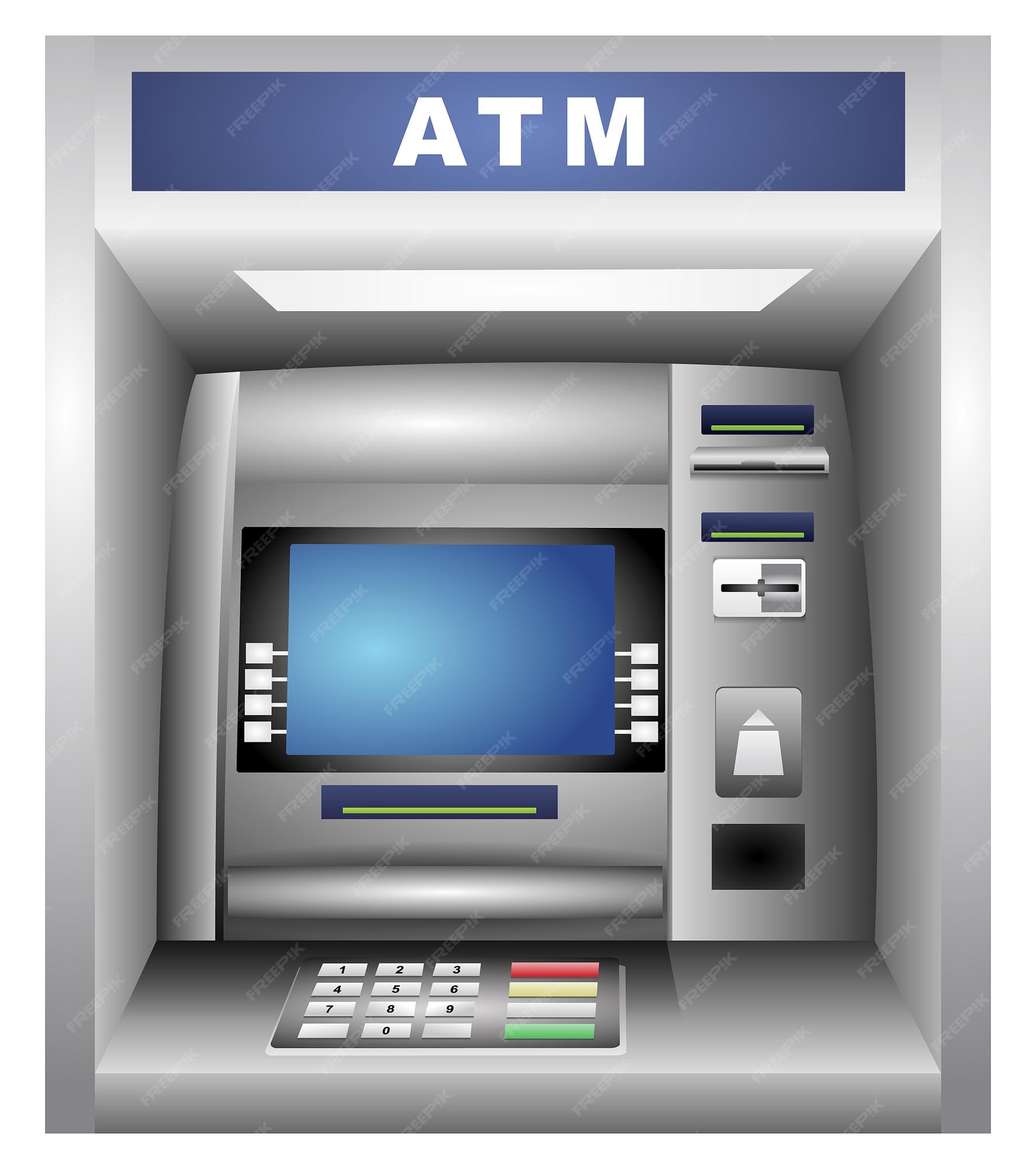
The following code defines an R function called atm() that simulates the basic functionality of an ATM. The function has a simple menu-based user interface that allows the user to check their balance, withdraw cash, deposit cash, or exit the ATM. The function keeps track of the user's account balance and updates it accordingly whenever the user performs a transaction.

To use the ATM simulation, you can call the atm() function. This will start the simulation and print the ATM menu. You can then enter your choice and follow the instructions to perform different transactions. When you are finished, you can choose the "Exit" option to exit the simulation.


Here is an example of how you might call the atm() function:


When you run this code, the atm() function will be called and the simulation will start. You will see the ATM menu and be prompted to enter your choice. You can then enter your choice and follow the instructions to perform transactions. When you are finished, you can choose the "Exit" option to exit the simulation.


Example Shiny App


This code defines the user interface (UI) for a Shiny app that displays a 3D plot. Shiny is an R package that makes it easy to build interactive web applications with R. The UI is defined using the shinyUI() function, which takes a single argument: a layout function that describes the structure of the UI. In this case, the pageWithSidebar() function is used to create a layout with a sidebar panel and a main panel. The sidebar panel contains two sliderInput() functions that create sliders for selecting the values of two parameters, A and R, that are used to control the 3D plot. The main panel contains a single plotOutput() function that creates an output area for the plot. When the app is run, the sliders can be used to adjust the values of A and R and the plot will update accordingly. The specific details of how the plot is generated and how it responds to changes in the slider values are not specified in this code and would need to be implemented in the app's server logic.


This code defines the server logic for a Shiny app that displays a 3D plot of a response surface. Shiny is an R package that makes it easy to build interactive web applications with R. The server logic is defined in the shinyServer() function, which takes a single argument: an anonymous function that specifies the app's behavior. The function has two arguments: input and output, which are used to access the app's input values (e.g. from slider controls) and generate its output (e.g. plots). The server logic in this code defines a single output, surfPlot, which is a 3D plot of the response surface. The plot is generated using the renderPlot() function, which takes an R expression that generates the plot as its argument. The plot is generated using the persp() function from the rsm package. This function takes several arguments that specify the details of the plot, such as the response surface model and the coordinates at which the response surface should be evaluated. In this case, the response surface model is heli.rsm, which is a previously defined object that fits a response surface to the heli data set. The coordinates at which the response surface should be evaluated are determined by the values of the input$Aslice and input$Rslice inputs, which come from the app's UI. These input values are used to calculate the coordinates x1 and x2, which are then passed to the persp() function as part of the at argument. When the app is run, the renderPlot() function will generate a 3D plot of the response surface using the persp() function. The plot will update dynamically whenever the values of input$Aslice and input$Rslice change, for example, when the user moves the sliders in the app's UI.


When the app is run ...